The Comparative Genome Dashboard
- Introduction and General Usage
- Survey of the Top-Level Panels
- Preferences, Options and Other Operations
- Understanding the Results
Note: if you dismiss this window, you can bring it up in a separate browser window at any time by clicking on the Help button in the Comparative Genome Dashboard page.
Introduction and General Usage
The Comparative Genome Dashboard is a tool for visualizing the overall biological capabilities of an organism or set of organisms, as encoded by their respective genome and pathway annotations. It facilitates a rapid user survey of all cellular systems and enables the user to quickly identify similarities and differences between organisms. In addition to reflecting the biology of an organism, the capabilities it depicts will depend on the quality of the genome annotation. The dashboard can also be viewed in a non-comparative mode to summarize the functional capabilities of a single organism.
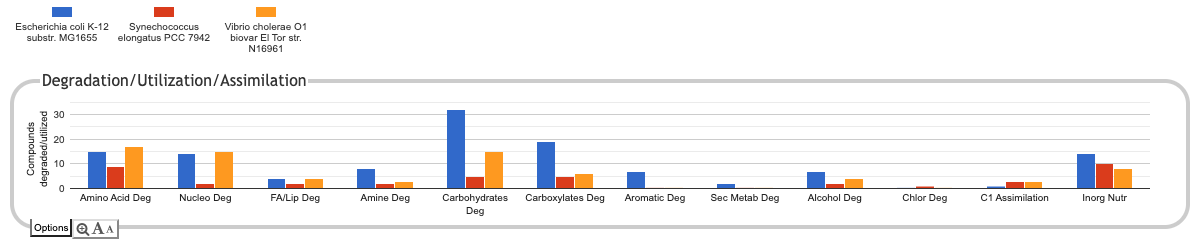
The Genome Dashboard consists of a set of panels, each representing a cellular system, e.g., Degradation/Utilization/Assimilation. Its organization is intended to mirror that of the Omics Dashboard. For each metabolic panel we show a bar chart (a plot) depicting the number of compounds produced or consumed, which is based on the metabolic pathways present in the organism database. For example, two plots within the Biosynthesis panel indicate the number of amino acids produced via Amino Acid Biosynthesis pathways and the number of carbohydrates produced via Carbohydrates Biosynthesis pathways. For non-metabolic panels the bar charts depict the number of genes annotated to each of a set of subsystems. Each panel has its own y-axis, and each organism is shown in a different color.
To access this tool, invoke the Comparative Genome Dashboard command in the Analysis section of the Tools menu. Next, select a set of organisms via the Select Organisms for Comparison button. We recommend keeping the number of organisms fairly small (i.e., not much greater than 10), as larger numbers can make the displays slow and hard to read. Regardless of the number of organisms selected, generating the dashboard data may take a minute or two.
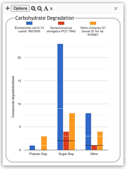
The following illustration depicts the
Degradation/Utilization/Assimilation panel for three
organisms: the model organism Escherichia coli, the
cyanobacterium Synechococcus elongatus, and the
pathogen Vibrio cholerae:
Click on Plots to Obtain More Detail
For each subsystem, such as Amino Acid Degradation or Nucleotide Degradation (subsystem names are typically abbreviated for compactness), a plot indicates the total number of metabolites degraded or utilized by each organism, but it does not tell you which metabolites. Clicking on a plot brings up a new panel that breaks that subsystem down into its component subsystems. Sometimes clicking on a detail panel will show yet another level of detail. At the lowest level, we show a base plot -- a rectangular grid of colored boxes, with rows representing a metabolite (that can be synthesized, degraded or transported, depending on context) or other biological capability, columns representing organisms, and the presence or absence of a colored box indicating whether that capability has been identified in that organism.
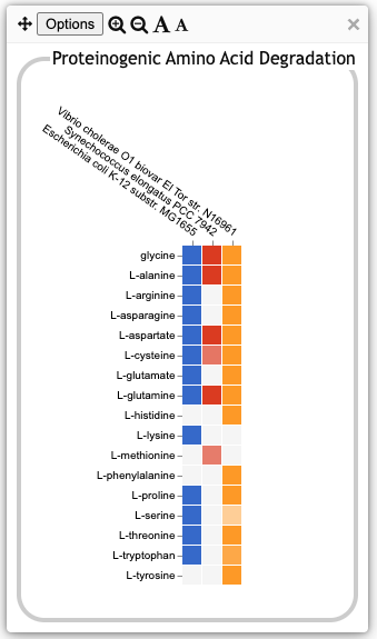
| The illustration at left shows the base plot for
Proteinogenic Amino Acid Degradation. It was produced by clicking on
the Amino Acid Degradation plot in the previous illustration and then,
in the resulting intermediate panel, clicking on the Proteinogenic
Amino Acid Degradation plot. Each row represents a single amino
acid. The box for an organism and amino acid is colored only if the
database for that organism contains one or more degradation pathways
for that amino acid. Note that there may be multiple variant pathways
defined for the degradation of a given amino acid. The box will be
colored if the organism is inferred to have at least one such
variant. A fainter colored box, such as the L-cysteine box
for S. elongatus or the L-serine box for V. cholerae at
left, indicates that even though a pathway was predicted to be present
in that organism, it has one or more pathway holes. The fainter the
color, the greater the fraction of the pathway that is missing. If you
mouse over a colored box, a tooltip window will list the compound name
and all relevant pathways for that compound and organism (you can also
mouse into the tooltip to click on links to show the display page for
the compound or one of the pathways in a separate tab). If you mouse
over a compound name or over an uncolored box, the tooltip
will include a link to a detailed pathway comparison page to help you
evaluate whether differences likely have an actual biological basis,
or if they are an artifact of differences in quality of annotation or
pathway prediction. If you click on the colored box, a new window will
show the pathway diagrams for all relevant variant pathways for
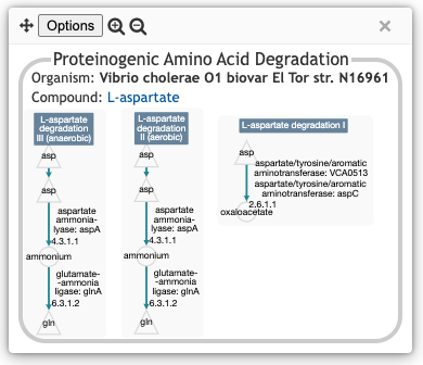
degradation of that compound in that organism. The illustration below
shows the result of clicking on the box for L-aspartate
and V. cholerae, and shows the three aspartate degradation
pathways inferred to be present in this V. cholerae strain.
|
Survey of the Top-Level Panels
The main Genome Dashboard display is made of the following top-level panels. Note that some subsystems within a panel -- and even an entire panel -- may be omitted if all of the selected organisms lack any data about those biological systems. For example, many databases lack GO term annotations, so a comparison made up solely of those databases would omit all GO-derived panels.
Biosynthesis and Degradation/Utilization/Assimilation
The first two panels, Biosynthesis and Degradation/Utilization/Assimilation, describe the metabolic capabilities encoded in the genome annotation, in terms of what metabolites can be synthesized by an organism and what metabolites can be degraded or otherwise utilized by the organism. The different subsystems within these panels are based on the MetaCyc pathway ontology, and the height of each bar reflects the number of metabolites in each category that can be synthesized or degraded, respectively. The data shown in these two metabolic panels (i.e., the counts of metabolites) reflects the set of pathways predicted or curated to be present in an organism. Note that some pathways are incomplete, with one or more enzymes not identified in the genome. For example, if a pathway for proline degradation is present in an organism database, the panel will assert that the organism can degrade proline, even if one or more reactions in the pathway have no assigned enzyme.
At the level of the base plot, if you mouse over a compound name along the y-axis, there will be a link to show a pathway comparison in a separate tab. If you are wondering why a pathway may have been inferred in one organism but not in another, this comparison will show enzyme assignments for each reaction in each organism.
Energy Metabolism/Precursor Metabolites
This panel summarizes energy metabolism and precursor-metabolite biosynthesis. Its first section shows energy-related pathway categories, and whether or not each organism has that pathway (or a pathway in that class, such as one of the variants of the TCA cycle). In this panel, the relevant information to convey is not the number of compounds produced or consumed by, say, Photosynthesis, but whether the organism has such a pathway at all.
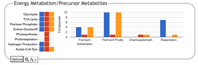
The second section is a bar chart that counts compounds produced or consumed by different subsystems. There are two plots for fermentation, one describing fermentation substrates, and the other describing fermentation products. The Respiration plot counts terminal electron acceptors that can be used by each organism. Because some of the plots in this panel count compounds produced and others count compounds consumed, the y-axis label just reads "Compounds", but the compound counts reflect pathways present in each database. Although the name of each subsystem is by abbreviated along the x-axis, bringing up the detail panel for a subsystem should show its full name.
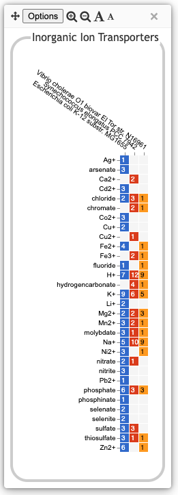
TransportAnalogous to the Biosynthesis and Degradation panels, the Transport panel is divided into subsystems based on different classes of metabolites that can be transported. The y-axis represents the number of metabolites transported in each chemical class. Unlike for the Biosynthesis and Degradation panels, the ability to transport a metabolite is determined not by the presence of a pathway, but by the presence of one or more transporters for that metabolite. In addition to knowing whether or not a metabolite can be transported, it is also useful to know how many such transporters exist and what they are. Thus, the base plot for a transport subsystem includes in each colored box a number indicating the number of transporters identified for that metabolite in that organism, as shown in the illustration at right. Mousing over a box produces a tooltip that lists all the relevant transporters. Click on links within the tooltip to bring up the protein page for a particular transporter. |
|
Central Dogma
This is the first of several panels describing non-metabolic capabilities/processes of an organism. What is counted in each of the component plots is the number of gene products in the genome associated with each process. The name of the Central Dogma panel is a nod to the so-called central dogma of biology: DNA → RNA → Protein. This panel contains a set of subsystems related to the process of going from DNA to functional protein, and thus its subsystems include transcription; translation; metabolism of DNA, RNA and protein; and protein folding.
| In order to determine whether a gene is associated with a given biological process, we use Gene Ontology (GO) biological process terms. Thus, the contents of these plots is highly dependent on the quality of the annotation of gene products to GO terms in each database. The base detail plot produces a rectangular grid of colored boxes, as for the previous panels, but in this case the rows represent the lowest level GO biological process term that a gene product is annotated to, as depicted in the illustration at right. The number in each box indicates how many gene products are annotated to that term. A given gene product can be annotated to multiple GO terms, so could be counted in multiple boxes in the base plot (in the higher level panels, each gene product is counted only once per plot, although a given gene product could of course be counted as part of multiple plots if it has multiple functions). GO is a complex, multi-level taxonomy, and not all gene products will be annotated to terms at the same level. If the most specific term that one gene product is annotated to is a parent of the most specific term that some other gene product is annotated to, both are shown. | 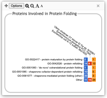
|
Mousing over a colored rectangle lists all the gene products annotated to that term, along with hyperlinks to see the detail gene page in another tab. There is also a hyperlink to the BioCyc page for the GO term itself, if you want to see the full list of gene products and other detail information for that term. Mousing over the GO term label provides a hyperlink to the term description at QuickGO.
Response to Stimulus, Cellular Processes
The Response to Stimulus and Cellular Processes panels describe additional sets of non-metabolic biological capabilities, derived from GO term annotations. The Response to Stimulus panel organizes gene products involved in responses to various forms of stress and other environmental conditions. The Cellular Processes panel summarizes a set of cellular processes largely related to the cell life cycle and participation in an organism community.
Virulence-Related
The Virulence-Related panel summarizes a set of biological capabilities particularly relevant to the study of pathogenic organisms. Some of these processes (such as Locomotion and Protein Secretion) may be more general and also relevant to non-pathogenic organisms, so the presence of this panel is not necessarily an indicator of virulence.
Cell Exterior
The Cell Exterior panel summarizes proteins involved with or localized to structures in the cell envelope. Like the several preceding panels, its contents are based on GO term annotations. Unlike the preceding panels, most of its constituent systems are based on Cellular Component GO terms instead of Biological Process GO terms (the Cell Wall Generation subsystem is an exception).
Preferences, Options and Other Operations
Panel-level Options
Each panel includes a set of controls for adjusting the panel display. In the top-level panels, these are shown at the bottom left. In pop-up panels, these are shown in the panel title bar. The and icons increase or decrease the size and scale of the panel graphs, respectively. If one of these is missing, it means that the graph is already at its minimum or maximum possible scale. The and icons increase or decrease the font size of text in the panel graphs. If font size is increased such that text no longer fits in the space allocated for it, the text may be truncated.
Additional commands are available in the Options menu. These include the ability to export the contents of a panel to either an SVG or a PNG image file, or to generate a comparison table page or a downloadable data table. For top-level panels, there is also a command to hide a given panel (buttons at the bottom of the page let you restore any hidden panels). From the main display page, you can also reorder the top-level panels by grabbing a panel title with the mouse and dragging it to the desired location.
Display PreferencesOn the upper right side of the main display is an expandable accordion widget for global preferences (this widget can be hidden by clicking the up arrow immediately below it). The Display Preferences section provides several settings that will apply to all relevant panels. If you have any popup panels open when changing one of these settings, you may not see the changes reflected in the popup until you close it and reopen it.
| 
|
Organism Preferences
The Organism Preferences section lets you customize how each organism is represented in the dashboard. You can selectively hide or show organisms, edit their labels and colors, and reorder them.
To selectively hide one or more organisms, uncheck the corresponding boxes. This will hide an organism from the display only. It will not affect the set of compounds, GO terms or panels that get shown (thus, you might end up with subsystems, compounds or GO terms that are visible in the various panels despite not being present in any visible organism). It will also not affect the calculations for determining common or unique compounds. To actually change the set of organisms for the entire analysis, use the Select Organisms for Comparison button.
To reorder the organisms, grab an organism name in the Organism Preferences section with the mouse and drag it up or down to the desired position.
To edit the label or color for one or more organisms, click the Edit Organism Labels or Colors button. Each organism label will be replaced by an editable text box and a color selector. Any changes will not take effect until you click the Done button.
Search
Two search buttons near the top of the page provide search functionality. The Search Compound/Pathway/GO-Term button lets you type in the name of any compound, pathway or GO term. The Search Gene/Protein button lets you search for genes or proteins by name or accession. Because genes and proteins are organism-specific, you must first specify which organism to query. In either case, use the auto-complete functionality to select the desired target. The Find button will identify all base panels that include the target. If there is just one, it will be opened automatically. If there are multiple such base panels, they will be listed. Select a panel to open it. The relevant colored box(es) will by highlighted with a dark border.
Understanding the Results
It is important to interpret the displays in the appropriate context. Most organism databases will have received little to no curation, so the results are highly dependent on the quality of the genome annotation and the accuracy of the pathway prediction process. You can get a rough assessment of the quality of a database by clicking on the button to Show Organism Versions and Summary Data. This table will indicate the tier, which is a measure of the curation level of each database (Tier 1: highly curated, Tier 2: moderately curated, Tier 3: uncurated), and give statistics on the number of genes with known or predicted molecular function (an indication of annotation quality); the numbers of genes, pathways, and transport reactions with experimental evidence; and the total number of GO term annotations. Organisms with very few GO annotations will likely have little to no representation in any of the non-metabolic panels (if none of the selected organisms have GO annotations relevant to the non-metabolic panels, then these panels will be omitted from the display).
Whether a particular compound is indicated as synthesized or degraded by an organism in the pathway-based panels depends on whether or not a corresponding pathway is predicted to be present in that organism. Accurate pathway prediction requires that the enzymes be correctly annotated in the genome and assigned to the correct reactions, that the relevant pathway be present in MetaCyc at the time the pathway prediction algorithm was run, and (if there are one or more missing enzymes) that the pathway prediction algorithm correctly assesses the likelihood that the pathway is present. Unfortunately, all of these steps introduce potential sources of error. Before drawing definitive conclusions about a particular metabolite, it is recommended that users follow the link to Show pathway comparison in separate tab from the tooltip that appears when you hover over a compound name. This page will indicate which reactions in the pathway have assigned enzymes and genes, and will show the name with which the enzymes were annotated. If an enzyme assignment is supported by experimental evidence, that will be indicated by a flask icon. If an organism lacks an assigned enzyme for a particular step, the software also checks to see if it has an ortholog to any of the enzymes from the other selected organisms (this is done only if orthologs have been computed between the organisms -- not all organisms have had orthologs computed). Ideally, this detailed comparison page should provide enough information to determine whether differences in pathway predictions are based on actual biological differences or are more likely to be an artifact of variation in annotation or pathway prediction.
Dashboard results can change as either the underlying databases are edited, or reactome and pathway predictions change (either due to new or changed pathways in MetaCyc, or due to algorithmic refinements). When citing dashboard results, be sure to indicate the version number both of the individual organism databases and of Pathway Tools (this information is all listed in the Show Organism Versions and Summary Data dialog).